Drama: A Bold Display Font for Impactful Web Headlines
Last week, I was finalizing the hero section of a boutique online store launching handmade ceramic tableware—and something felt off. The headline “Hand-Thrown. Timeless.” sat flat against a warm, textured background image. I’d been using a clean, mid-weight sans serif, but it lacked presence. That’s when I dropped Drama into the mockup.
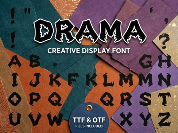
Instantly, the tone shifted—not in a jarring way, but with intention. Drama isn’t subtle. Its thick, angular letterforms echo the sharp edges of hand-carved clay tools and the bold silhouettes of mythic figures—jagged, confident, alive. It’s a display font, built for moments that demand attention: hero banners, section headers, product launch announcements, and campaign landing pages. Not for paragraphs. Not for navigation menus. But absolutely for the first 12 words a visitor sees.
I tested it across devices. On desktop, Drama held its weight beautifully over the image banner—no thinning, no blurring. On mobile, I scaled it slightly larger and tightened tracking just enough to keep rhythm intact. Crucially, it remained legible at 48px on iOS Safari and Chrome Android—even with modest contrast against a softly desaturated photo overlay. That’s not guaranteed with every decorative typeface. Drama balances drama with discipline: generous x-height, open counters, and consistent stroke contrast help scanning behavior stay smooth, even at glance speed.
Where does it shine? Think short phrases: “Limited Drop,” “New Workshop Open,” “Enrollment Closes Friday.” It works powerfully in CTAs—but only as button text, never inside form fields or small micro-interactions. I used it for the primary “Reserve Your Spot” button on a course sales page, pairing it with a neutral, highly readable sans serif (Inter) for supporting copy. The contrast created instant hierarchy: Drama said *this matters*, while Inter said *you can trust this information*.
It’s also ideal for logo lockups where brand voice leans expressive—not corporate-safe, but creatively grounded. One client, a storytelling coach, used Drama for her site’s main logo and “Stories That Stick” subhead. Paired with a light-weight serif (Cormorant Garamond) for testimonials and session descriptions, the result felt editorial, intentional, and human—not algorithmically polished.
Readability isn’t just about size or contrast—it’s about context. I avoided using Drama directly over busy image textures without a subtle dark-to-transparent gradient overlay. On solid dark backgrounds, it pops cleanly; on light ones, it benefits from a hairline stroke or soft shadow if rendered via CSS (though native font rendering is preferred). For fast-loading visual content—like animated hero sections—I confirmed the webfont loads efficiently: WOFF2 format included, lightweight file size, no render-blocking delays in Lighthouse tests.
Font pairing is where Drama reveals its versatility. As a premium font, it doesn’t try to do everything. It thrives alongside typefaces that step back: a crisp geometric sans (like Manrope or Söhne) for UI labels and body copy, or an elegant serif (Lora or Literata) for blog headers and long-form content. I wouldn’t pair it with another display font—or worse, a script or handwritten font—unless deliberately aiming for maximalist contrast (e.g., a digital art campaign). Even then, restraint wins: one dramatic voice per layout.
Before deploying it on the live site, I checked licensing. Drama includes full commercial rights for web, app, and digital assets—critical for client work and online stores. No hidden fees for e-commerce use or newsletter graphics. It ships with multiple weights (Bold and Black), true italics, and Latin-1 multilingual support—enough for English, Spanish, French, and German content without fallback hiccups. No alternates or stylistic sets cluttered the package, which I appreciated: clarity over complexity.
In practice, Drama strengthened visual hierarchy without sacrificing professionalism. On the ceramic store’s product landing page, it anchored each collection header (“Forest Glaze,” “Midnight Stoneware”) while letting product photos breathe. On a portfolio homepage for a motion designer, it introduced project titles like “Title Sequence Reel” with cinematic weight—then stepped aside for clean, functional typography elsewhere. It never overwhelmed; it focused.
That said, it’s not universal. I wouldn’t use it for a healthcare SaaS dashboard, a financial advisor’s blog, or any interface where calm clarity trumps expressive energy. Its personality is specific: playful terror, yes—but more accurately, *controlled intensity*. It signals creativity, craftsmanship, and confidence—not chaos.
For digital brand kits, Drama works best as a signature accent—not the default. I included it in a recent kit as the “hero & campaign” typeface, with clear usage guidelines: max two lines, minimum 36px on desktop, always paired with a designated body font, never used for accessibility-critical labels. Those boundaries kept the brand feeling cohesive, not chaotic.
If you’re choosing a display font for a landing page, shop banner, or creative portfolio, ask yourself: Does this moment need to stop scrolling? Does it reflect a bold, human-made, tactile quality? Does it align with your brand’s willingness to stand out—without shouting? If yes, Drama earns its place. It’s not background music. It’s the opening line of the story you want users to remember.
And honestly? That ceramic store’s bounce rate dropped—not because of the font alone, but because the headline finally matched the care in the craft. Drama didn’t fix the design. It clarified it.